close
2019 - 2020
ACCUROgo
A mobile app that lets clinicians access and manage patient records anytime, anywhere.
Healthcare
EMR (Electronic Medical Record)
Mobile
B2B
Material Design System
Flutter
01 / 07
Project Overview
ACCUROgo is a companion app to the ASP-hosted AccuroEMR solution, enabling healthcare providers to access key EMR features from their smartphone or tablet, from anywhere with an internet connection.

I've facilitated the entire end-to-end process as the primary designer, evolving the product from 0 to 1.

A special thanks to Adam Coppock, who led the design during the project's early stages, as well as thanks to Lisa Kim, who also greatly contributed in the product's design.
The Problem
Electronic Medical Records(EMR) software is a collection of features and tools that allow healthcare providers to manage patients' digital medical records and automate clinical workflows. For a long time, desktop software has been the main scenario for clinicians. But as mobile devices get popular, there is a significant demand to expand the EMR experience to help healthcare providers access and manage the information for various scenarios and from different times and locations.

With Accuro as our desktop EMR solution, we hope to create a companion mobile app, ACCUROgo, to fill the needs of the mobile part and enhance the overall EMR experience for the healthcare providers.
02 / 07
Cross-Functional Team
The ACCUROgo project was the first time that we worked as a cross-functional team. So, it was quite a big change for every team member on their mindset and the new collaboration workflow. We adopt agile and sprint methodology. More importantly, we moved from the old school requirement first culture to a more user-driven culture.

As a designer, I had the opportunity to collaborate very closely with various roles, such as the Business Analyst, Product Manager, Product Owner, User Researcher, Technical Architect, Developers, QAs, etc. But we do have many challenges during the transition process.
Challenge 01 - Gaps in Collaboration
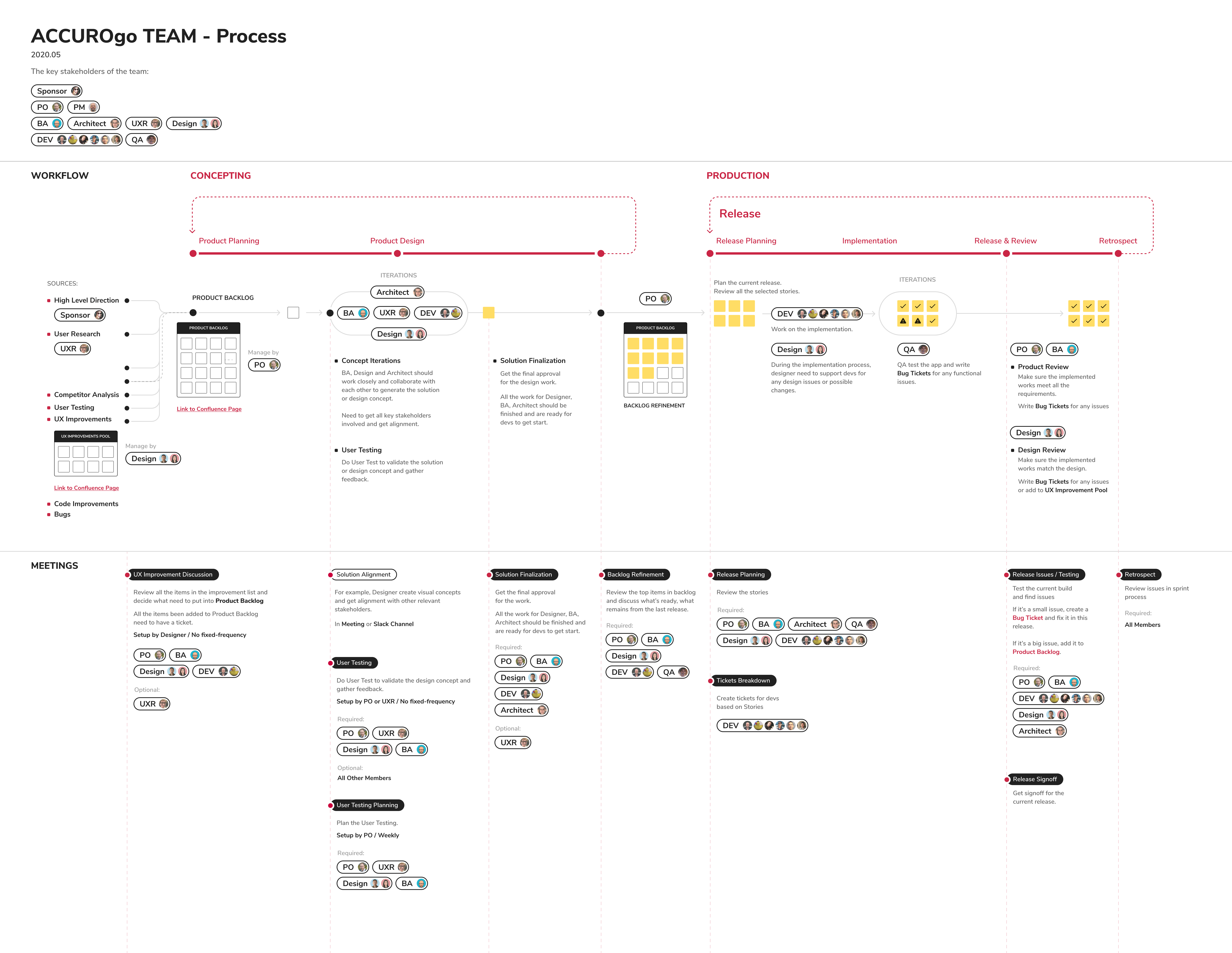
Before working in a cross-functional team, people tend to just focus on their own work driven by requirements. They don't need to know what other people are doing. With the new way of collaboration, every team member needs to understand what each role is supposed to do and the general workflow.

However, we don't have a clear document to define that. Most time, our brilliant product owner(PO) stands in the middle and communicates with everyone to fill the gaps to drive the project forward. But this makes him super busy and tired.
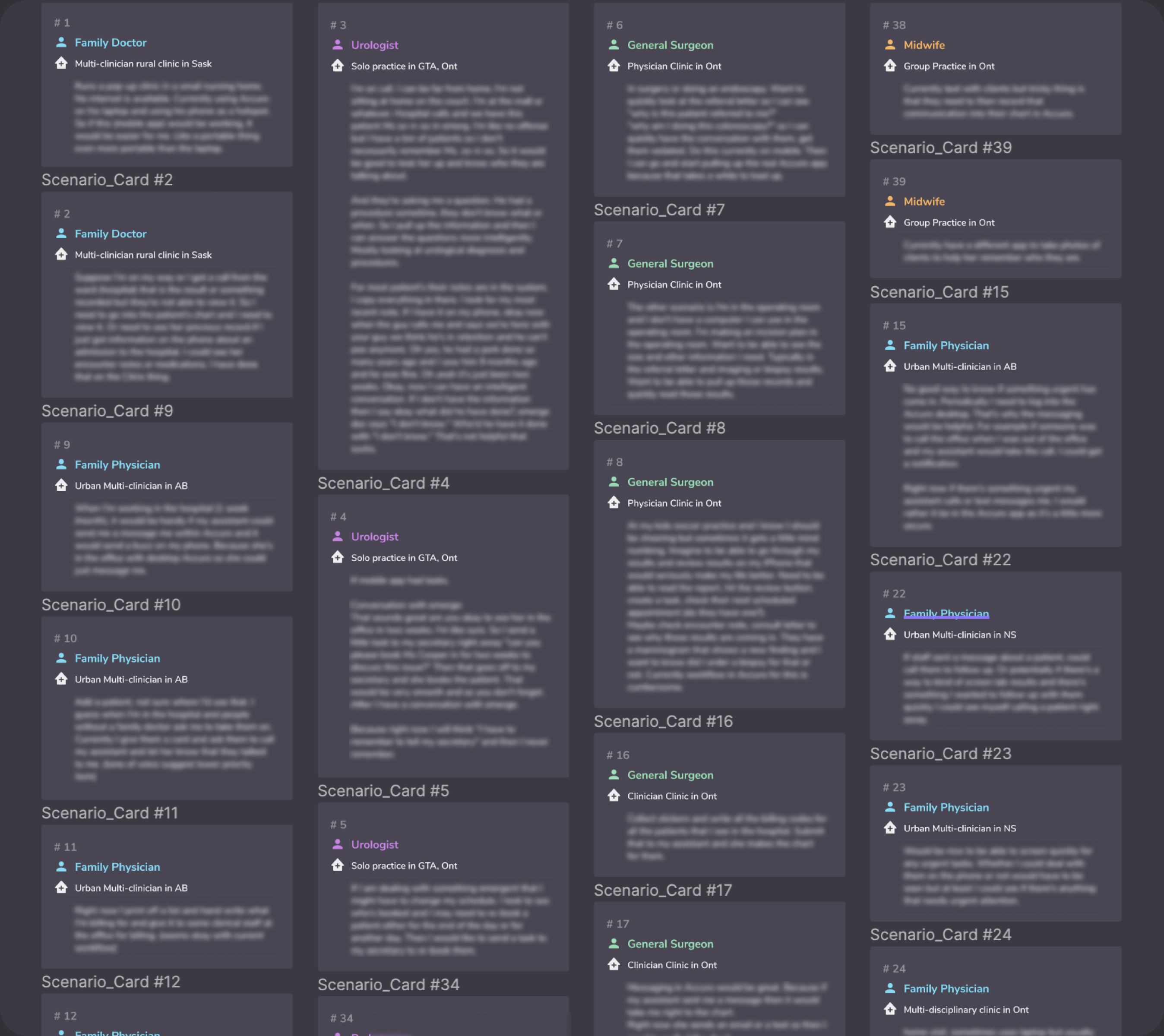
What IĀ Did
As a designer, I am not just focusing on product design. I take design as a way for problem-solving. So, as a team member, I am always observing and thinking about optimizing the workflow to make the collaboration more smoothly and efficiently. So I created a workflow chart and collaborated with the PO to refine it. I documented the general process and all the corresponding meetings on the key points. Also include different roles in the chart. With this information design, it's more straightforward for team members to understand the bigger picture and where they fit in this process. That helps to fill the gaps in the collaboration.
Challenge 02 - Design Managment and Delivery
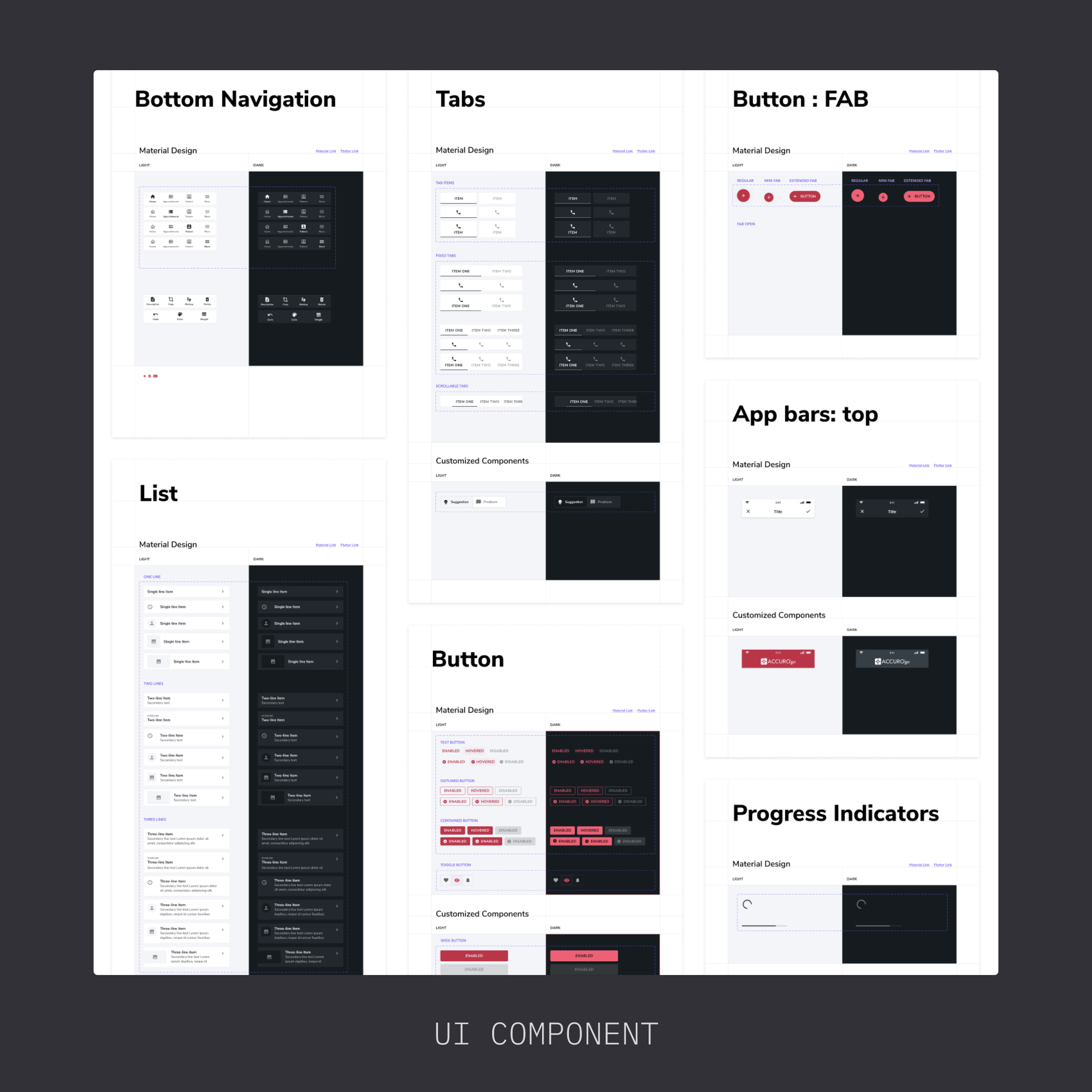
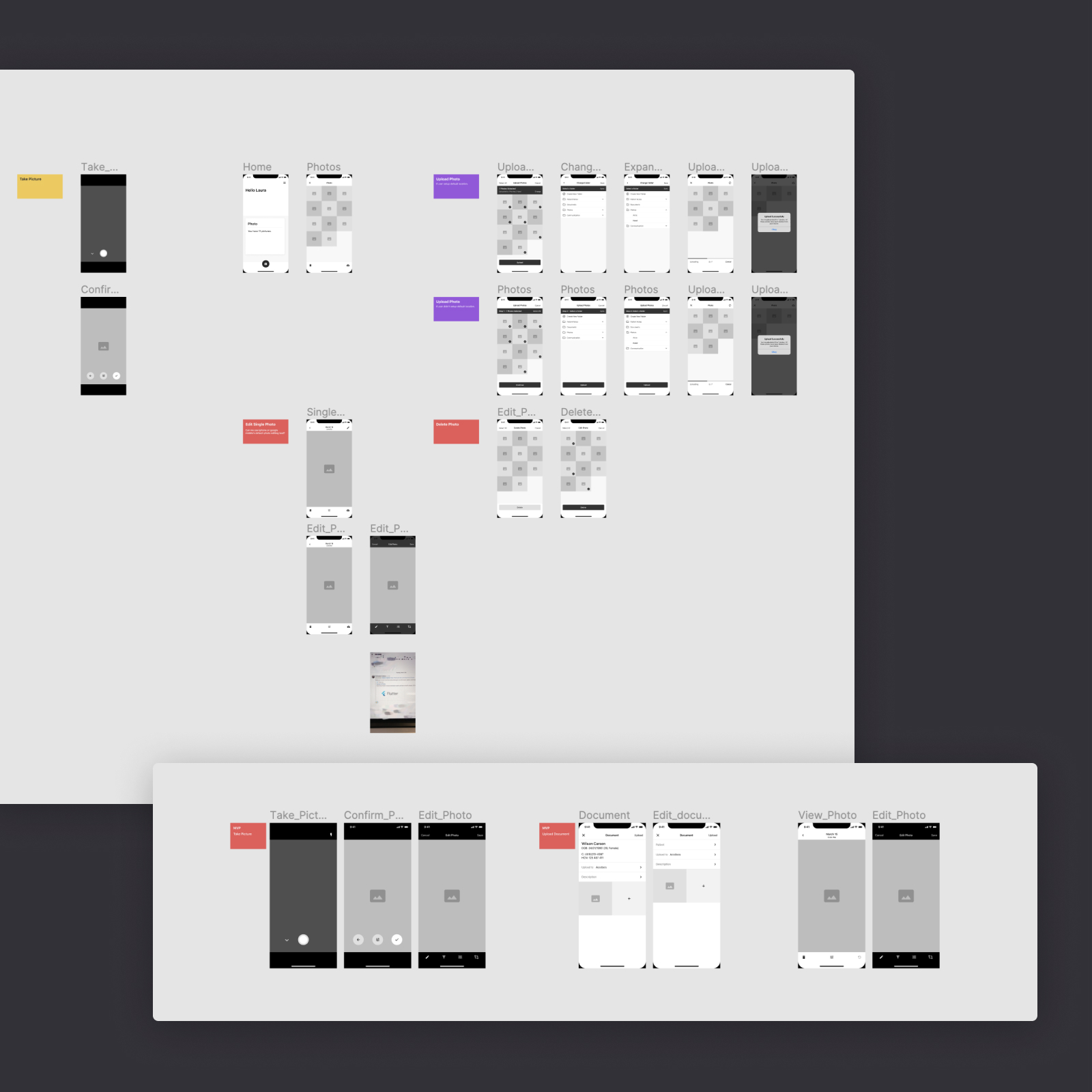
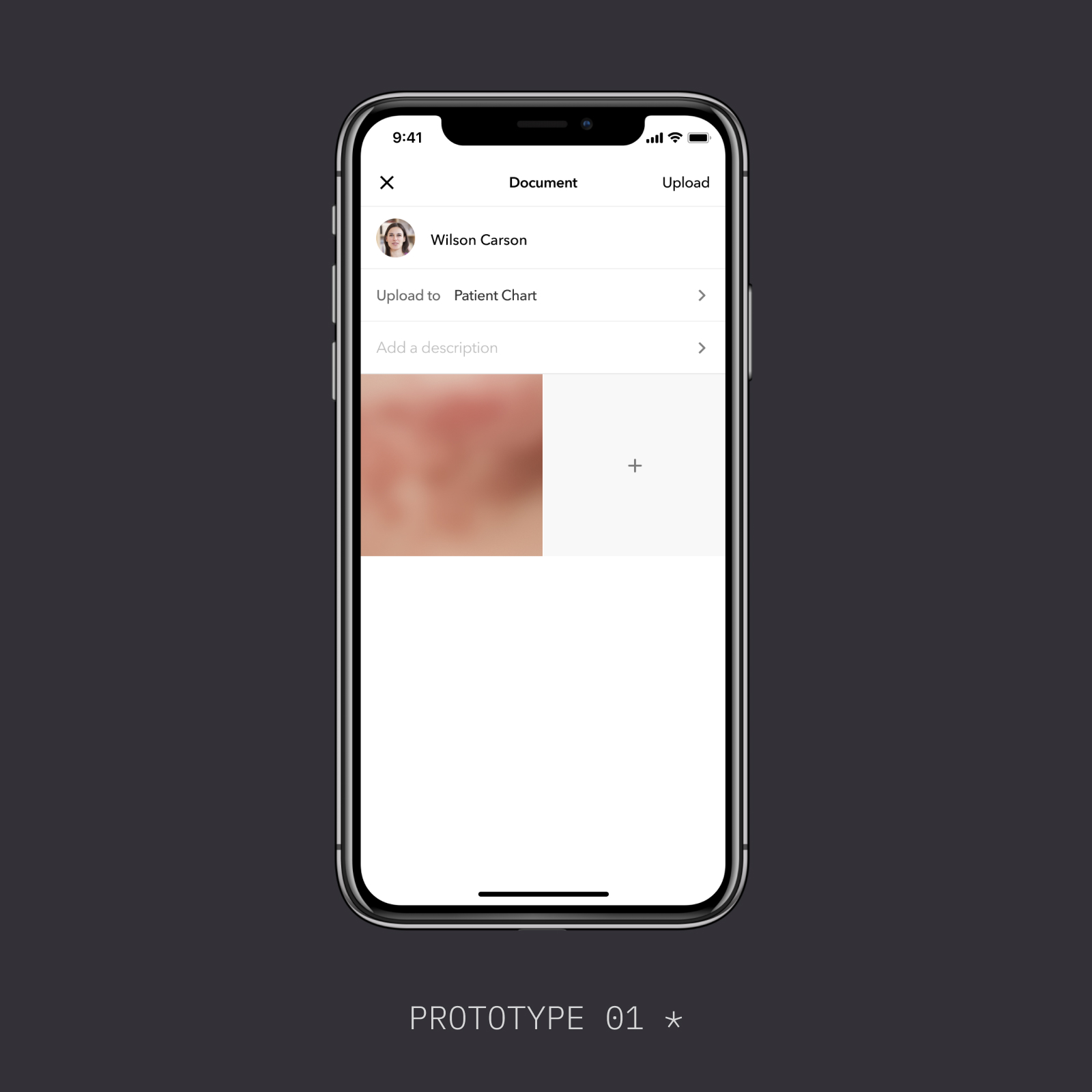
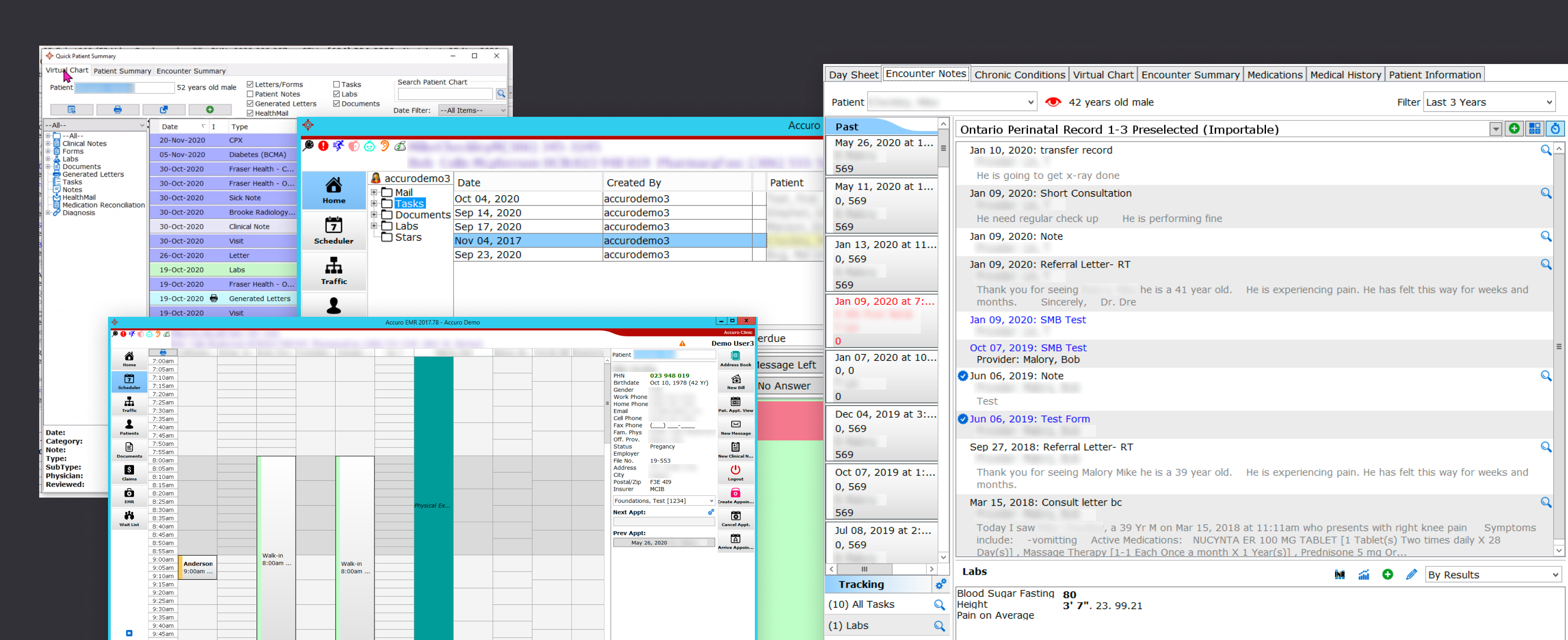
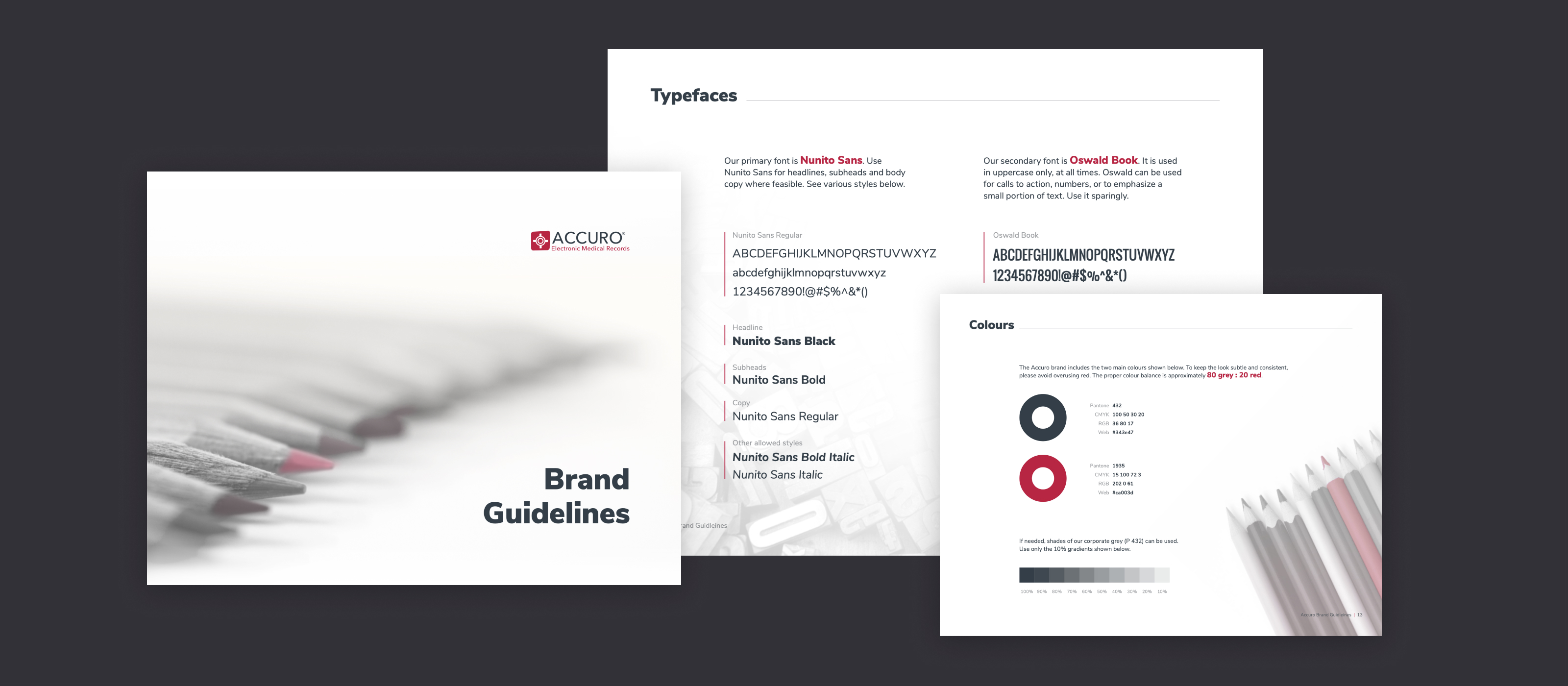
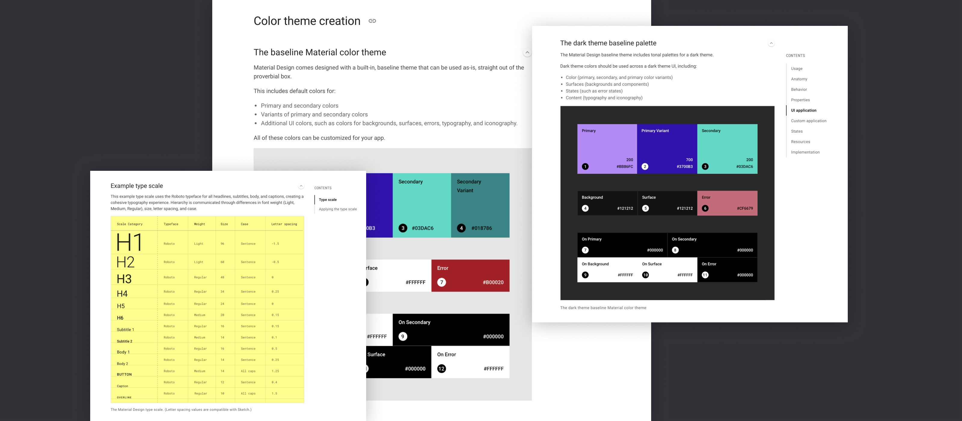
I was the first designer in our company to adopt Figma as the primary design tool in an actual project. Before Figma, we used Sketch for design and Zeplin for design delivery. Figma combines these two and allows people to work online in the same file. This was not accepted by many people initially.

With a big canvas in Figma, where the designer may put all the different design versions together, quickly navigating to the right design is challenging. Also, in our collaboration with developers, they are already familiar with the way how Zeplin works. The design delivery in Figma is not static images as to how Zeplin does. So the design may get changed sometimes. That's where devs always complain.

During that time, Figma was not the mainstream, and there was no big community. I have to explore the solutions and find the best practices to optimize the design management and the design delivery processes.
What I Did
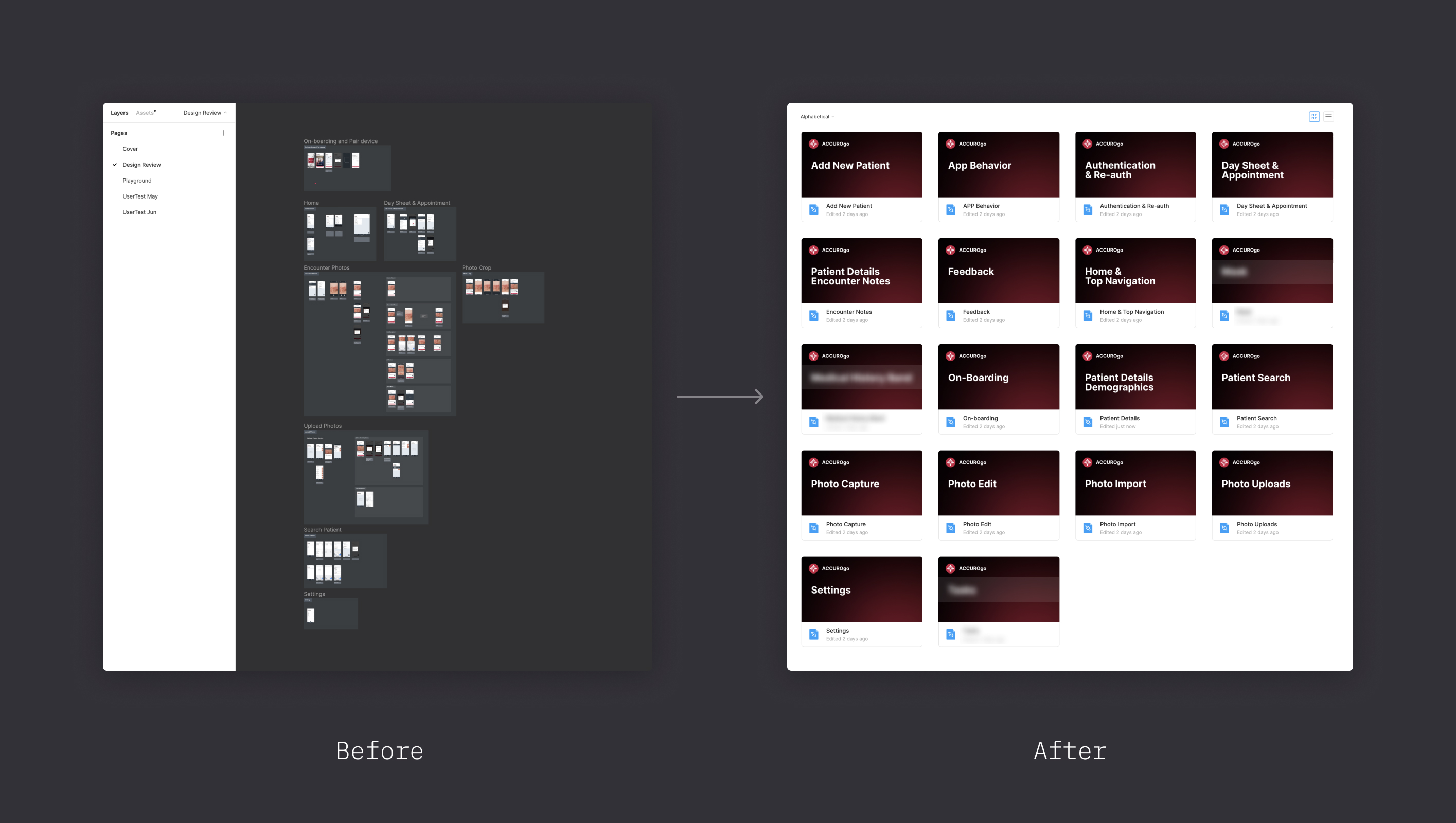
Initially, we had all the features in one design file in Figma. That makes it hard to navigate and even takes a long time to load the whole file. I started to separate all these key features and put them individually in their own file. This makes it much easier for developers to find the right design.
I also invented the tags mark to indicate the design status. So developers only need to focus on the designs with 'FINISHED' and ignore the others. The 'FINISHED' tag means the design has been reviewed and finalized, and the designer will not change it.

Later, as we put each feature into a single file, I invented a new file template to make it even better and also include other key sections like 'Light/Dark Theme', 'Multi-Devices', 'Tablet', etc. By doing this, designers could keep iterating the design concepts in a safe area while developers could implement the confirmed design without any worry.
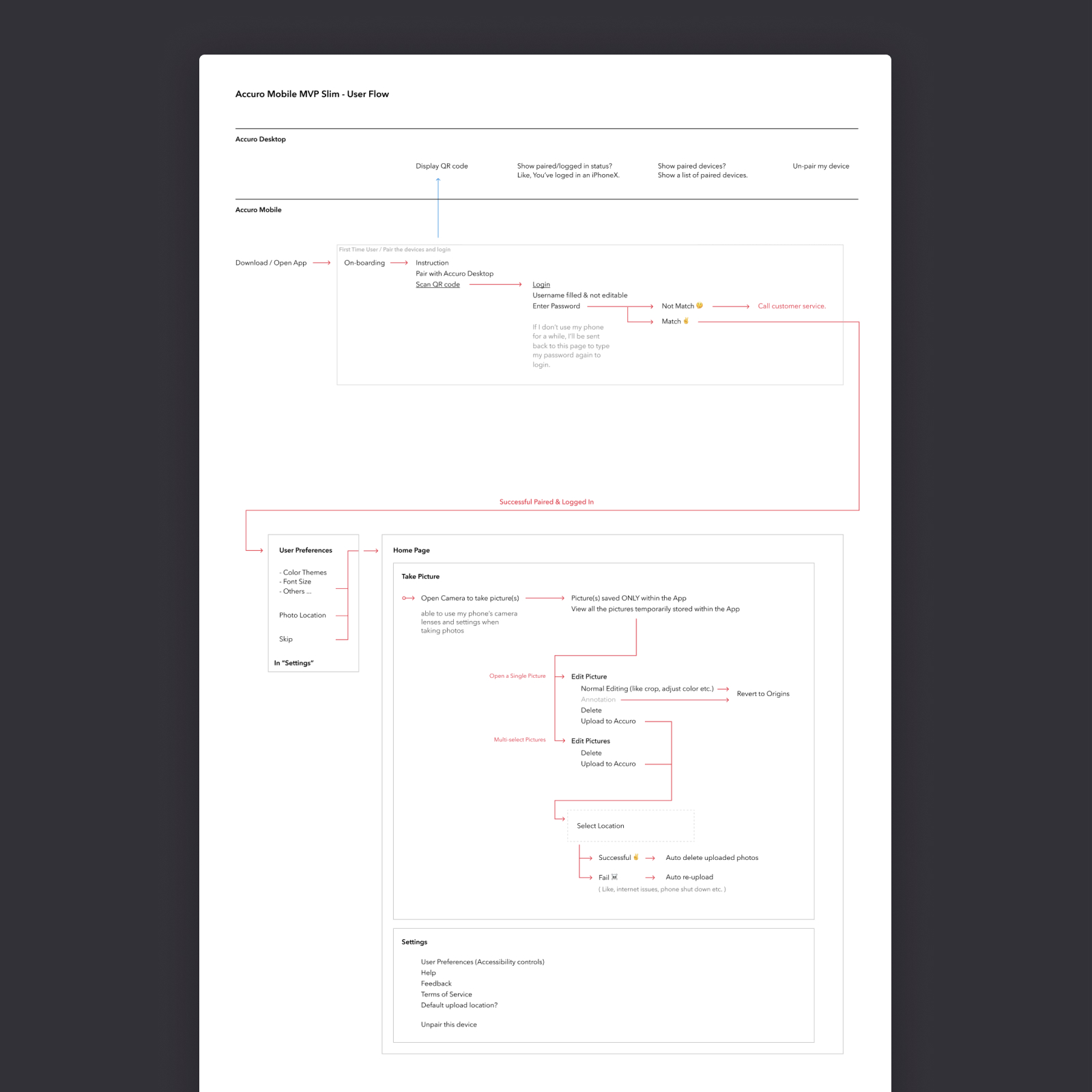
Product Design Process In Cross-Functional Team
In the overarching product design process, we typically have two main focuses. Product concepting and implementation. As a product designer, I collaborated with different roles in both focus areas.
Concepting
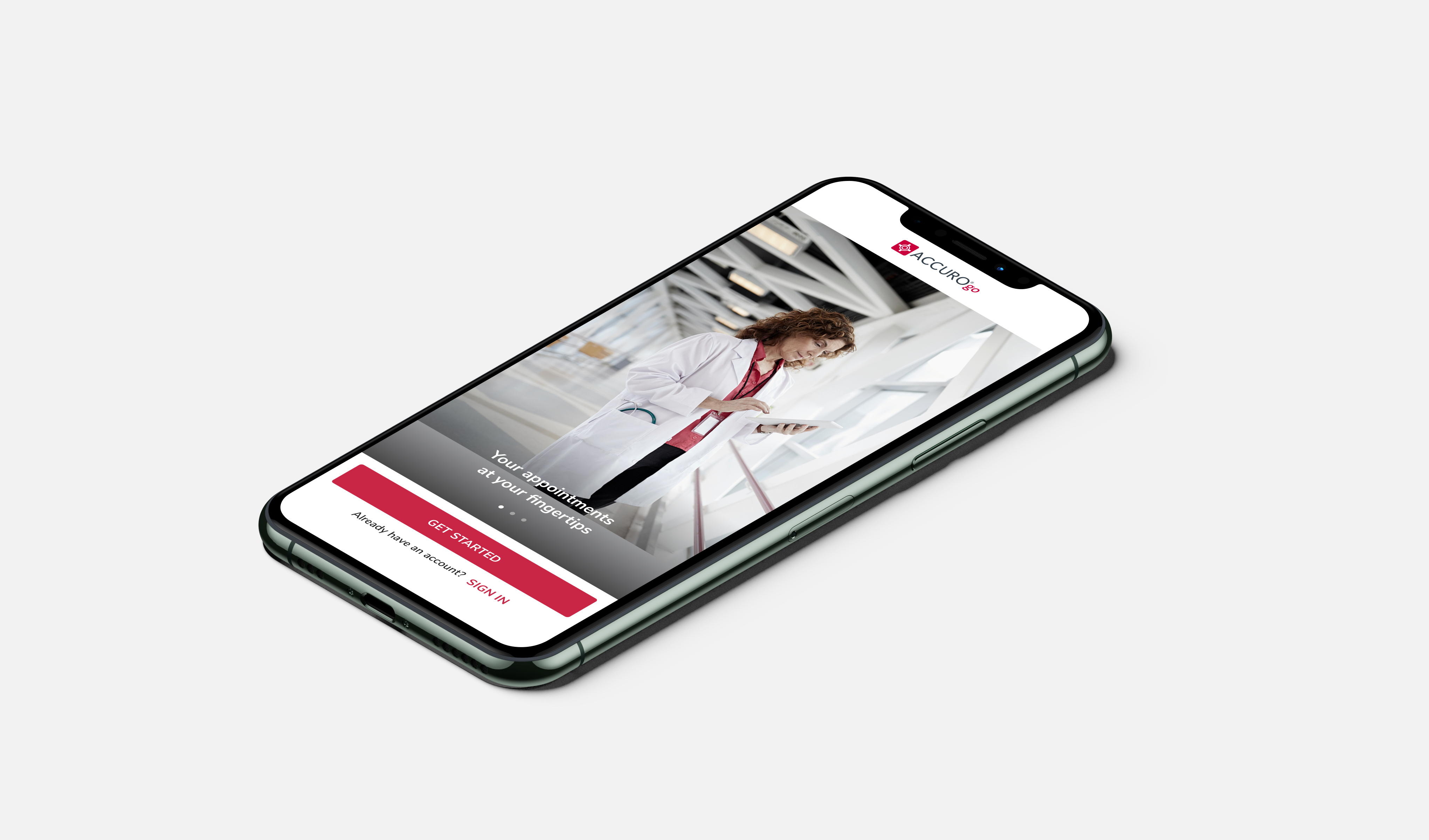
For each feature of ACCUROgo, we typically began with user research, and UX research. This would encompass practices such as defining User Personas, establishing User Journey Maps, drafting User Stories, and so forth. Additionally, I would also perform research on a variety of different UX patterns. We involved various stakeholders first hand, to ensure that problems were well understood from multiple perspectives.

Depending on the complexity of the work, we also invested in establishing clear Information Architecture. From there, I would often jump into Figma to create high level mockups and wireframes. For this project, the UI work also happened in parallel. The continued investment in a design system largely reduced the time I spent in repetitive UI designs.

The next step we took in our iteration cycle was to perform User Testing to validate the design concepts and gather key feedback. I would work closely with our Senior UX Researcher, Product Manager, and Product Owner on this and prepared the Prototype in a timely manner to enable the user testing of the concept. Following the user testing process, I would iterate based on feedback to refine the product UX and UI to its polished state.
Production
Once in production, the designs required to be mostly finalized with refined specifications, so that developers can begin to implement the UI and functionality. It was also crucial for developers to be involved earlier in the concepting stage, so that they became familiar with the technical direction and were able to begin building early on with adequate context and awareness.

In this production cycle, as the designer I often played a supporting role to rapidly design any missing parts identified, and adjust the designs as new discoveries were made.

Once the product is built, I also worked closely with QA and Product Management to ensure the product was created as expected, and any identified design bugs or improvement opportunities were flagged and prioritized for future iterations.
This is a basic description of the workflow. In reality, we could have many features running in parallel, and it's essential for me to be adaptable and jump between these two focus areas as needed, while continuously zooming in and out to work on detailed designs whilst also considering the bigger picture of product strategy.
What I Learned In Cross-Functional Team
Working in a cross-functional team aided me to step back from the area of design, and encouraged me to think more about the product from a bigger picture and higher level. I began to think more broadly, considering factors beyond the product design, such as investing to support the team and cross-functional process to become more efficient and build stronger collaborations between our various team roles.
03 / 07
UX - User Research
User Research is the starting point for the product UX design. We got the external resource to create solid user reports and an internal UXR team to create user persona and scenarios. Through all these efforts, the goal is to better understand our target users, their pain points, and the opportunities. Based on these, we started to come up with solutions and get all the essential features that we wanted to build.
04 / 07
UX - Concept Iteration
Take "Photo Capture &Ā Editing" as an example
Core Insights &Ā Direction
Based on the user research, we found these core insights:
  • Doctors usually are very busy and under pressure. They have no time. So any solutions for them need to be quick and convenient.
  • Doctors take their patient's privacy very seriously. They would resist using products that are hard to use rather than engage with products that do not feel secure.
  • Doctors tend to use their own phones to take photos and then have to email them to their accounts and download them to save to Accuro. They want to have an easy and secure way to take pictures on the go and to support quick records.
With these insights, we get the precise direction to create an app that allows doctors to take photos, edit photos and send them to the patient's EMR quickly and securely.
Design Research
Then I started to research different photo apps and looked at their flows and standard practices.
Create Initial Concepts
Based on the photo standard practices and the requirements from Business Analyst(BA), I started to create the flows and wireframes.
Concept Iteration and User Test
Then I created a couple of different concepts with high fidelity UI and performed usability testing with the UX researcher and the design lead.
However, after the user tests, we felt the concepts I made here were not intuitive and straightforward enough. It takes time for users to understand the interaction and get tasks done. So we decided to do more iterations to make it quick and simple.
New Iteration
My design lead Adam Coppock and I worked on a new concept together. We came back to the points gained from the initial research (Doctors having limited time) and took the insights gained from the usability tests to create a concept focused on the user's core objectives. The new concept allowed the doctor to take a number of photos rapidly and then upload them securely to the clinic's EMR system with a single click.

For this concept, we experimented and removed steps such as giving the user individual previews and confirm screens for each photo. We also moved all the edit options to a secondary level in the navigation so that the user could still access them if they really needed to.
Here are some captures from the advanced prototype that Adam and I worked on together.

Before we started to build a prototype, we came together and sketched out the idea. Next, we quickly created another rapid prototype in Figma to test out this idea. However, when we used the rapid prototype, we were a little disappointed.

We learnt that there was a key moment of interaction missing because of the limitations of the prototype. It's the point between the user using a live camera rapidly taking photos and knowing that the photos had been saved without pressing save. We also found because this flow was quite a new experience, we struggled to interpret the benefits of the idea with a static hotspot prototype, limiting its potential.

Although disappointed, we were still curious about this idea. We felt we would need a more realistic camera experience to get the level of feedback we required to validate this idea. We looked into different high-fidelity prototyping tools and found that Origami would allow us to test out a live camera feed as part of the experience.

We broke the idea down into testable segments and built a series of prototypes in Origami. For each of the user tests, we found many valuable insights that helped refine the usability of the experience.
* USERĀ TESTĀ 01
How does rapid photo taking match your workflow?
* USERĀ TESTĀ 02
Is accessing to edit mode intuitive?
* USERĀ TESTĀ 03
Are the edit models useable?
* USERĀ TESTĀ 04
Would markup work for you?
* USERĀ TESTĀ 05
Would close work for you?
* USERĀ TESTĀ 06
Is 6 photo limit intuitive?
* Prototype videos recorded by my colleague Adam Coppock.
Eventually, it turns out that this idea supports the doctors' behaviours and goals. It leaves an impression of feeling natural and intuitive in the context of their specialist workflow.

We also learnt that doctors rarely have the time to crop images, so that feature became less of a value to build and was deprioritized from the roadmap.There were some more minor issues with usability found from the mistimed notifications.

We also improved information such as iconography and text to strengthen the experience in the user's mind.

Our team also added messaging to communicate that the app would securely send the photos to the clinic EMR, and the photos will not be stored on their personal device. Once again, this is driven by the initial insights gathered from the research at the beginning of the project. And will support the doctor in knowing that the patient's information has been thought about.
For myself, this was a big lesson. To observe how a great designer solves the problem really gets me to reflect on my design thinking and process. I didn't always have the key principle, make it quick and convenient, in mind. After the design research, I tend to follow the common practices and not try to jump out of the box. A lot of my focus was on the visual aesthetic part. I should put more attention on the fundamental UX and try to improve usability. Also, more importantly, be open to any suggestions and changes. Learn from others and get the better design solution together. I think this is very important for team collaboration and the success of any project.
Final Design
Following this direction, then I worked on the product UI and got all the screens for delivery. I added a few minor features to the screen based on the new requirements and upgraded the UI with dark mode for better accessibility.
05 / 07
Product UIĀ Strategy
The Problem
As we make a companion app, creating a consistent user experience is always the principle we keep in mind. However, the look and feel of the current AccuroEMR is out-of-date. By looking forward, we need to create a new visual language for the product UI that is still under the current branding system. So, one of the goals for this ACCUROgo project was to experiment and explore a modern look and feel.
What I Did
For this project, we choose Google's Material Design as the design system, Flutter as the code framework. We believe this will naturally bridge the design and development together to speed up the product building process. We can speak the same language and directly use the components from the same source on both the design and development sides.

With this in mind, I started to work on the new UI system within Material Design framework, following our existing branding guidelines.
Also, we noticed that the information from the Material Design official site may not always align with the content on the Flutter site. As developers are mainly based on Flutter to implement the theme, we also investigated Flutter to ensure the design was good.

Then I played with the font sizes and colours in the product UI, tried different combinations and tested them with different screen sizes. Because it's a mobile app, I also checked the UI directly on different phones to make sure it looked good.

Accessibility was an essential consideration during the process. We used the Figma plugin to test colour contrast to ensure it gets to the AA standard. And we also designed the full dark mode.
Based on these, we came up with the product UI system, including the typographies, colours, icons and all the UI components.
06 / 07
Other Key Feature At a Glance
07 / 07
Marketing Video
Lastly, I also worked on the digital marketing for this product to concept, design and create the promotion video as well as some marketing visuals used in app store.
😊
Thank you for reading
I’d be happy to share more or answer any questions you may have.
Made with
ā¤ļø
in Vancouver